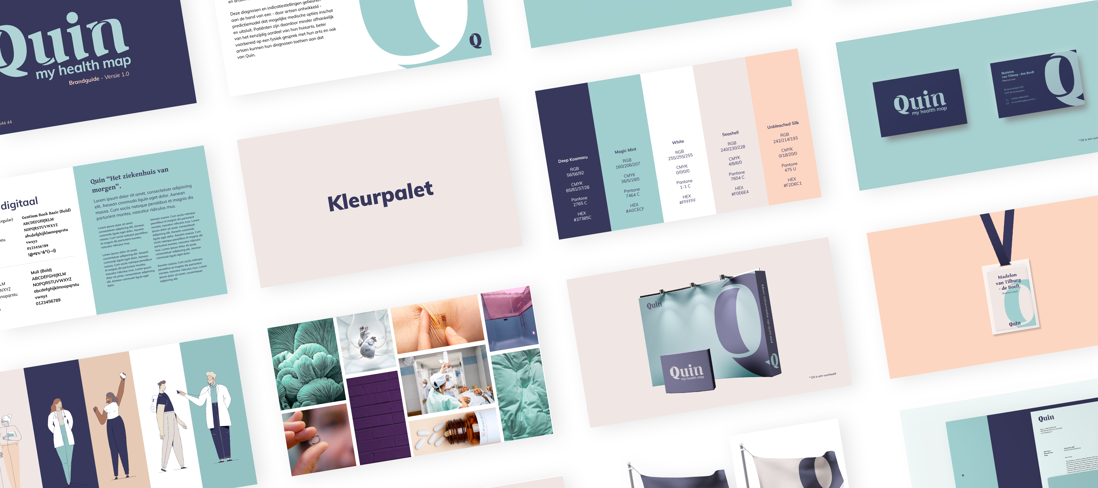
An app and platform that lets people combine their data with medical intelligence so they can determine their ideal care process together with their doctor. A deeply personal experience that needed a human brand. Meet Quin, your personal guide to better grip on your health.
Quin Healthcare in your own hands
Every so often you get the exciting opportunity to join a client in their start-up stage. One with the ambitious goal to improve both healthcare in the Netherlands and people’s relationship with their own health made it all the more impressive.
Hello, I'm Quin
Experience
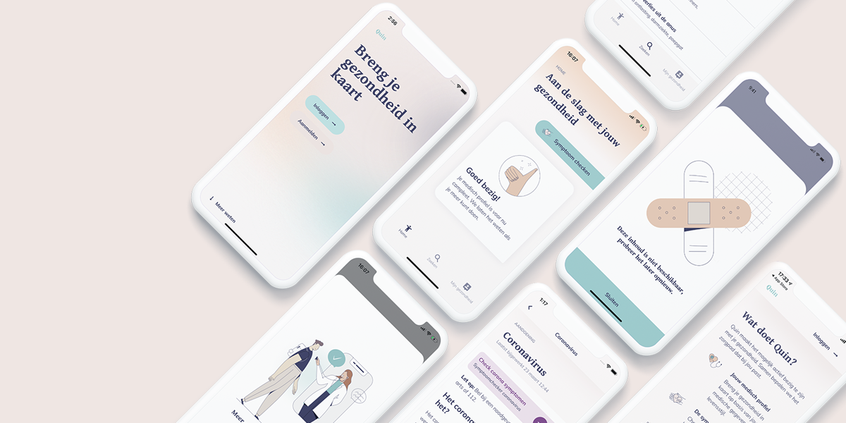
Quin is meant for everyone. Name and design are therefore friendly, accessible and empathetic. Quin, My Health Map allows people to compile their own medical profile, check symptoms and guide them through options when making medical choices. Functionality, UX, tone-of-voice and design have been developed to eliminate thresholds, evoke compassion and help navigate your available next steps in care.
In parallel with the launch of app and platform, the first physical locations of Quin doctor's office have been opened. These office are part of the Quinstory and yet have their own character, requiring their own branding and house-style. Different halves of the same brand.
Working across the street
To work at optimum effectiveness, a number of Valleyrians are fully embedded in the Quin office, where they help to build both the experience and the brand. It is, some what helpful, that we recently became neighbours. Allowing both teams to catch-up over a Friday drink by simply cross-ing the street.
Result
The first consumer reactions are extremely positive. This brand identity hits exactly the right note. A very promising start of the ambitious adventure that we are happy to join the Quin team for. Quin: My health map is currently available in the Apple Appstore and on Google Play, were it currently holds the highest score of 5 stars at the time of writing.
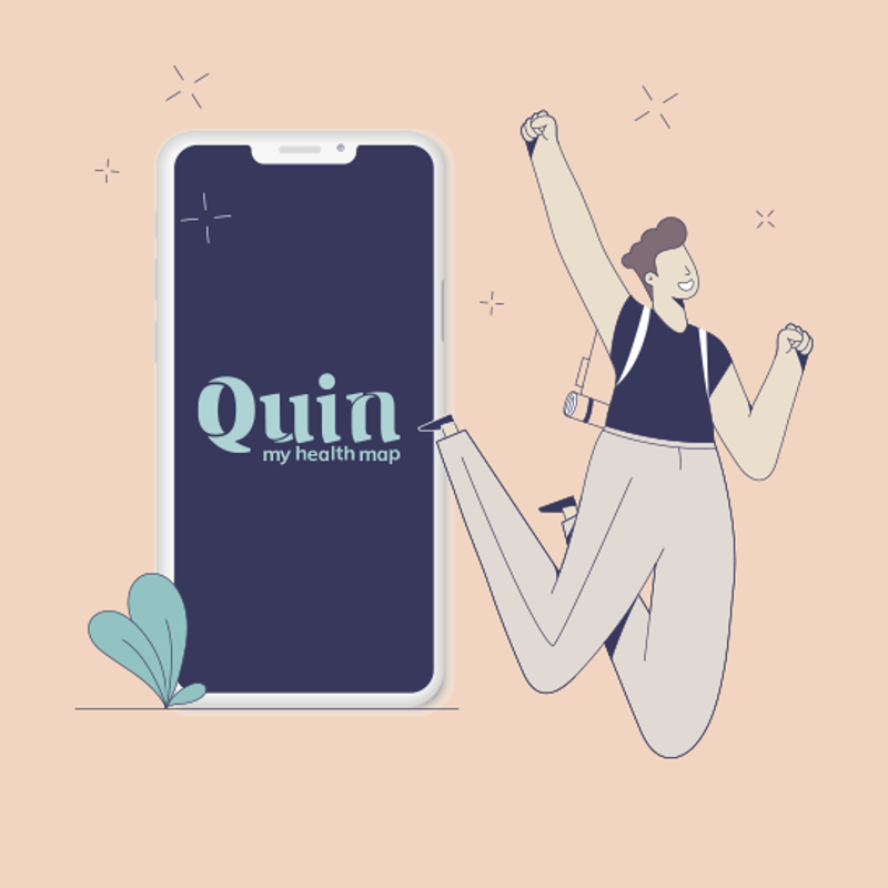
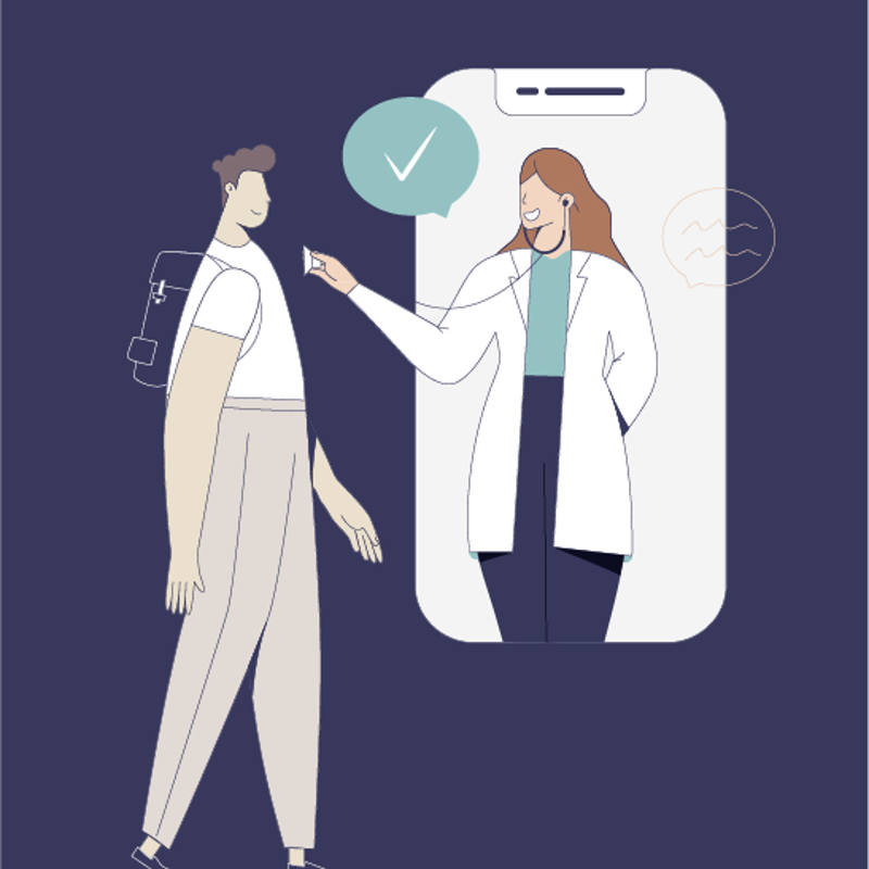
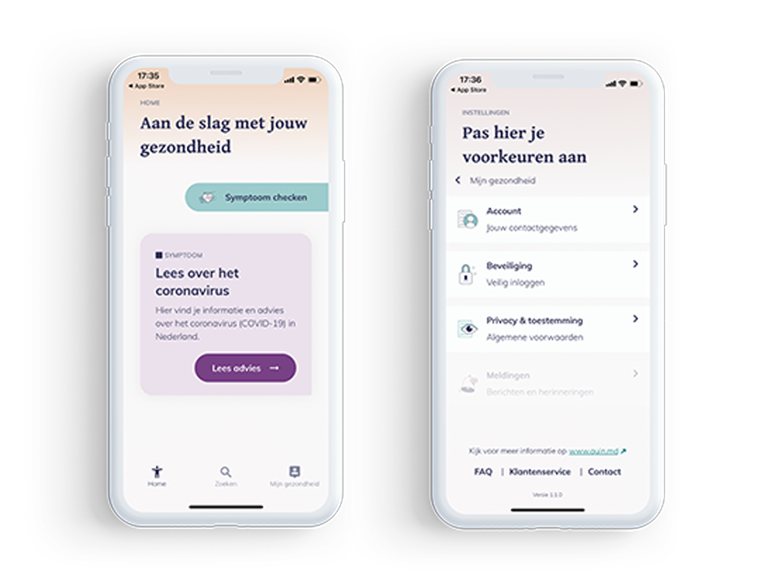
Set of modular illustrations created as part of the house style.
